The Origin of the Mitsubishi Ichigokan Museum,Tokyo Logo
HATTORI Kazunari
(Graphic designer)
The first time I heard the words “Mitsubishi Ichigokan Museum” over the phone, it struck me as a very unwieldy name. Not only was it long, but it seemed strange to use the kanji for “building” twice in one name. I was glad to be asked to design a logo for the museum, but at the same time I wondered if the name couldn’t be simplified to Mitsubishi Museum or something. A few days later some people from the preparatory office came to see me and told me various things about the museum. First, they explained that in 1894 the British architect Josiah Conder had designed the original Mitsubishi Ichigokan as the first office building in Tokyo’s Marunouchi district. Now they were planning to faithfully reconstruct the building, which had been demolished some years earlier, using the same method of manufacturing the components and construction techniques. While the original building had housed a bank and some offices, the new one was going to be reborn as a museum, which would function as a base for cultural activities. Mentally, I realized the significance of “Ichigokan” and that a few important points were condensed in the name— i.e., Mitsubishi, Ichigokan, and Museum.
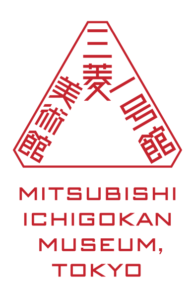
The first proposal I came up with was a logo based on a brick motif. I was impressed to find out that because there was no domestic company that could manufacture the bricks in the original way, a huge number of bricks was going to be specially made at a factory on the outskirts of Shanghai. Then skilled bricklayers from all over Japan would assemble to lay the bricks one by one. That was why I devised an “M”-shaped mark made of bricks. It seemed like a snappy design, but there was still something missing. I was suddenly reminded of that first phone call. That strange name said everything about the museum. Maybe I could just scrap the M and make a symbol out of the entire name. It could be something like a name stamp with a triangular shape surrounded by Mitsubishi’s “three diamonds”. By positioning the words “Ichigokan” and “Museum” on either side of “Mitsubishi,” I was able to arrange everything into a symmetrical triangle. Then by trimming the points of the three angles, I made a slight decorative touch with a classic feel that created a link to 1894. Next, by dividing the English name “Mitsubishi Ichigokan Museum, Tokyo” into four lines, I made an inverted triangle that added a sense of stability when I put it at the bottom. It was this series of accidents that led to my second proposal—in other words, the logo that is now used at the museum.
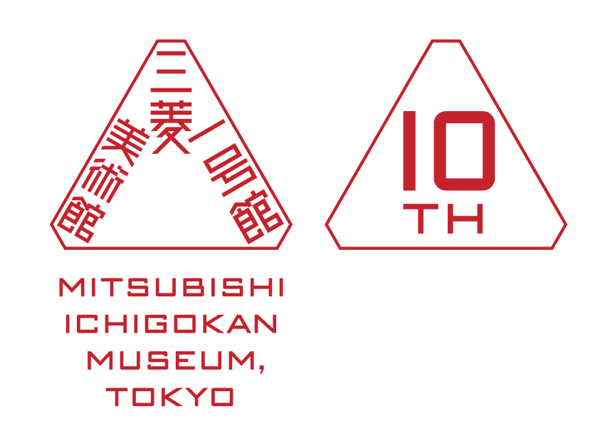
Generally speaking, no matter how innovative a logo might seem at the time, most of them start to feel old after twenty or thirty years, and people start to talk about the need to revamp them. I think of this as having more to do with the destiny of a design than the designer’s skill. Since I included an antique touch in the Ichigokan logo from the start, I had hoped that this would conversely extend its lifespan. I can’t say what will happen in the future, but the logo has survived the first ten years. I have also designed a tenth anniversary logo. I placed another triangle alongside the original one, and then put “10th” inside of it to create what seemed like an attractive chain of shapes. The reason this design works is that, thanks to the continued use of the original triangular logo, the museum and the image overlap.
You could also look at it another way. When people accept the outstanding work of a given company or group, the logo takes on a natural appearance. The commonplace quality of a commonplace design is the secret to its success, just as the eccentric quality of an eccentric design is what makes it loved. It is a great honor to think that my logo for the Ichigokan has somehow helped in the museum’s activities and its charming operations.